

One of the aspects of the brief was to create work influenced by illustrators.
I first attempted to create a self-portrait influenced by Bob Sheriffs, influenced by the portrait on the right. Sheriffs uses exaggerated shapes and expressive lines to create the portrait, I emulated this in my self-portrait. I feel Sheriffs' style is daunting to replicate as his work is so distinct an well balanced. Sheriffs' style is effective in capturing the form of a person's face, a limitation of this style is that the effect could be seen as quite flat and may not be effective in creating a realistic portrait. |
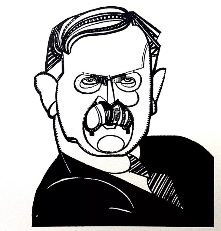
Bob Sheriffs
|
|

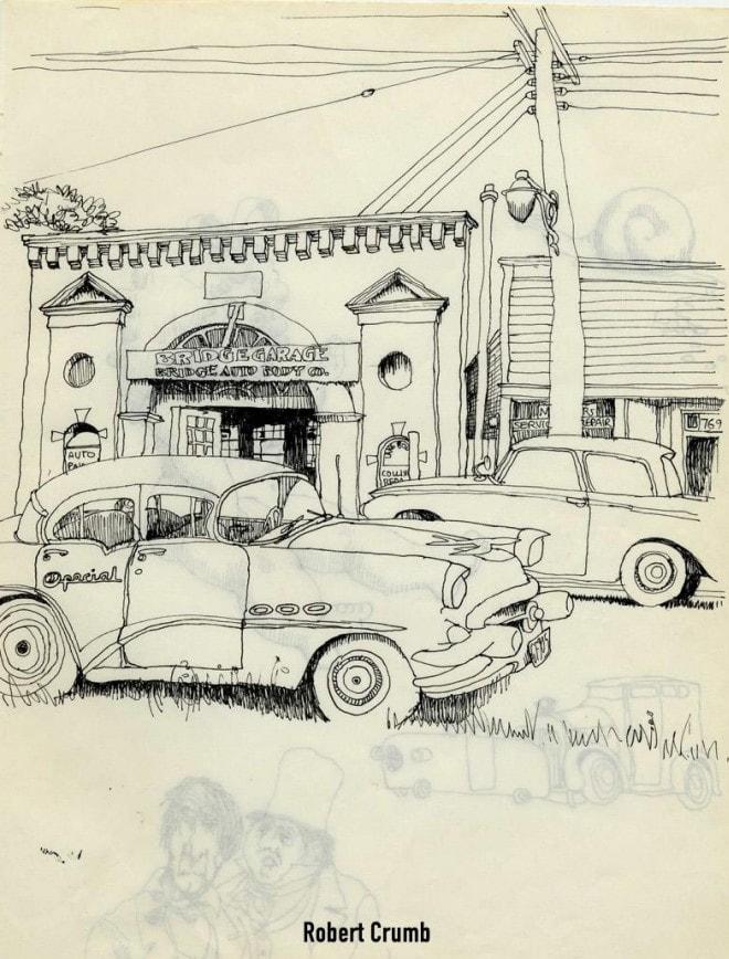
Robert Crumb in the illustration to the left uses an ink nib pen at a distance to create a wavy uneven line.
In my illustration above I try to mimic this style however with an fine liner pen that I held at a distance. I feel I was somewhat successful however notably Robert Crumb very rarely using hatching or lines to depict form or depth in the illustration to the left whereas in my illustration I use it heavily. To better recreate Crumb's style I would have to minimize my use of hatching. Crumb's loose style in this illustration is effective in creating a sense of fun and spontaneity, a limitation of this style however there isn't a distinct sense of tone and value. |
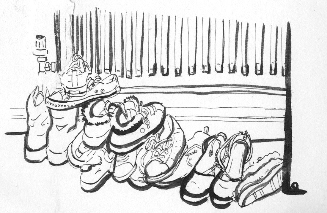
Above is my attempt at copying the style of Lucinda Rogers, specifically her illustration to the right.
Rogers uses a nib pen as well as a brush, I copied this technique in my illustration. I admire Rogers' style of illustration, her use of line weight and playfulness is expertly done. I feel by studying her style I was able to work in a way I may not have tried otherwise and the technique is one I would use again. |
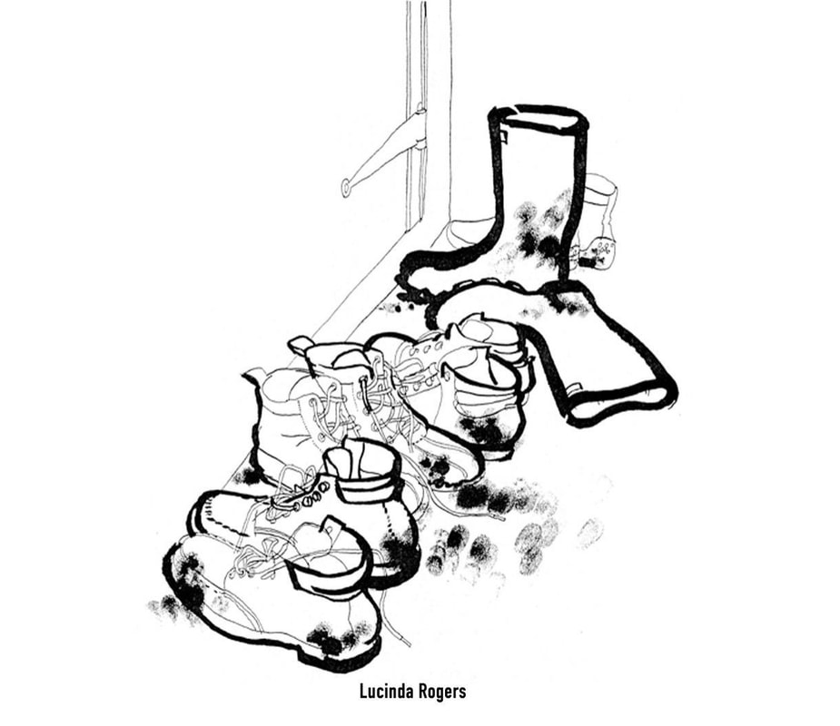
Her style is effective in highlighting the important areas of the illustration, in which she wants the viewer to see first, her backgrounds tend to be thinner line weights, almost monoline.
However, a limitation of this style is capturing a sense tone, the style somewhat means her backgrounds could be read as a liminal space. |
Sketchbook Pages from over this project.