|
This is a project that's been kicking about in my head over my time at uni. However, in third year I finally gave it a go.
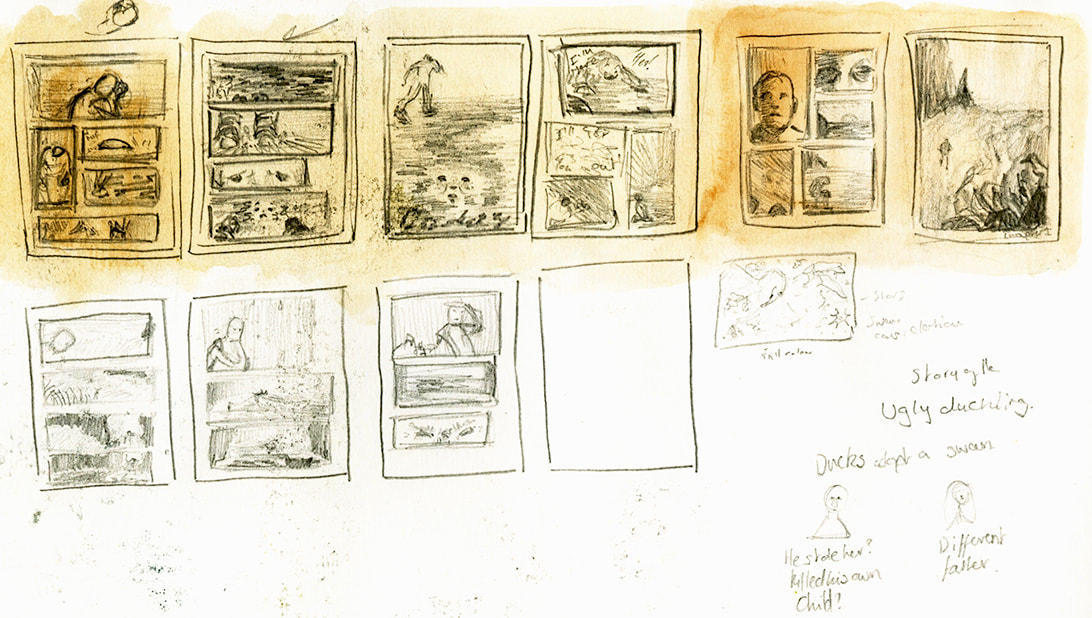
My goal was to create a good chunk of the comic as a concept for what the comic could be. A synopsis for this comic is a young man for unknown reasons is heading off to sea, whilst followed by an otter that's disappointed with the man.
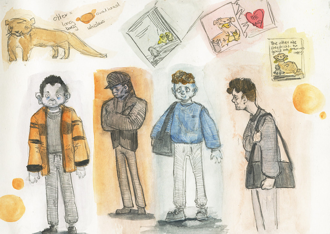
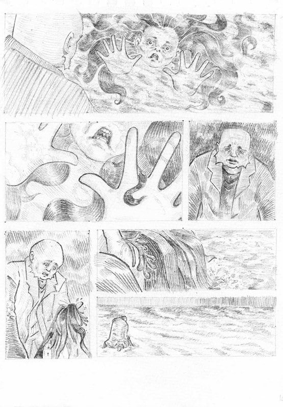
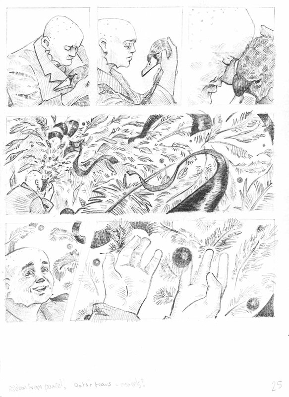
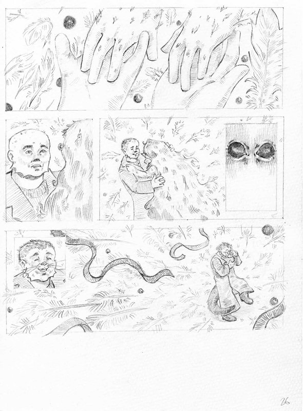
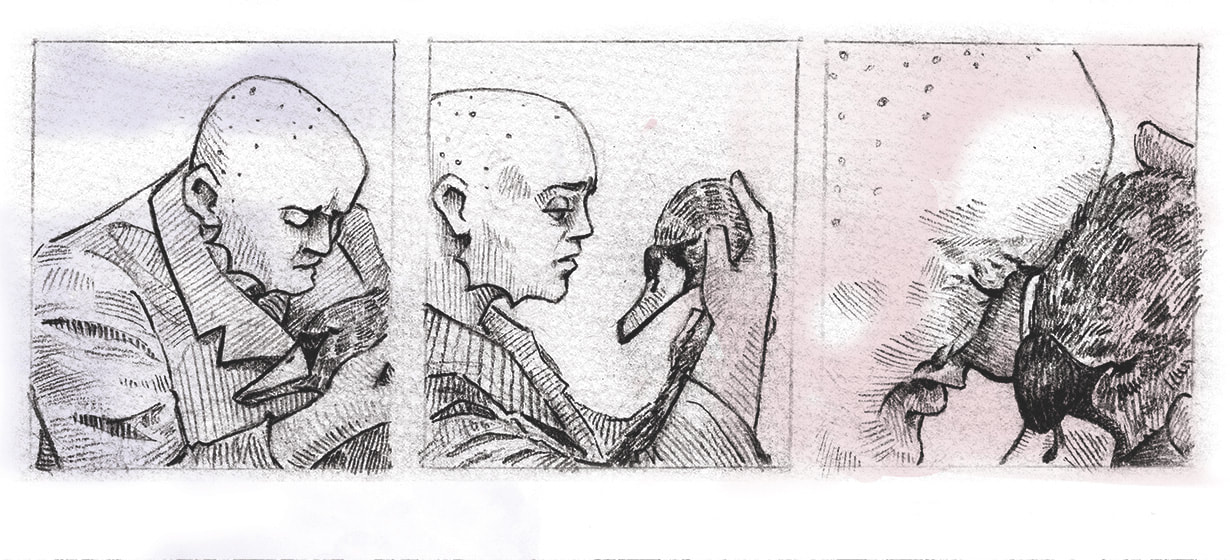
It's all a dream. The young man has the condition Syndactyly in his hands, which he has passed onto his newborn daughter. Presented with this, he feels guilt for the bullying she may receive in life that he himself faced. His guilt causes him to flee the hospital and leave his daughter. At the bus stop outside the hospital he falls asleep and the contents of the comic begin. The comic uses the sea as an allegory for the man's mindset and the animal imagery is used to convey ideas of name calling. The man is an otter because of his seemingly 'webbed hands' and the daughter is presented as a swan to reference the story of the Ugly duckling. The story is of a man accepting his daughter by accepting himself. 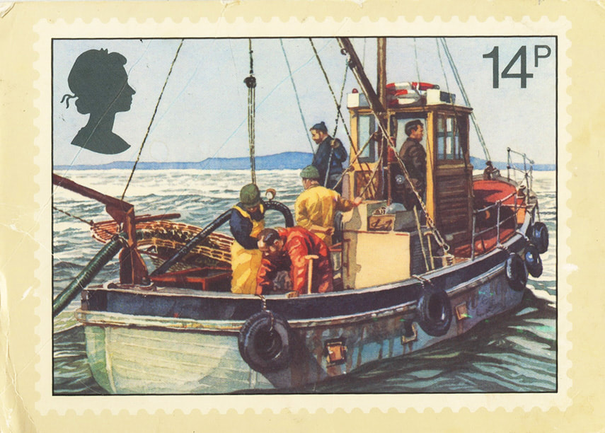
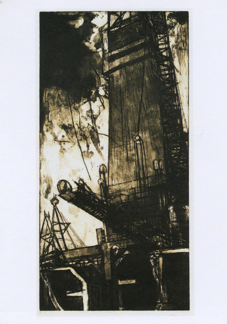
A postcard I got from the charity because it reminded me of the Seafarer.
|
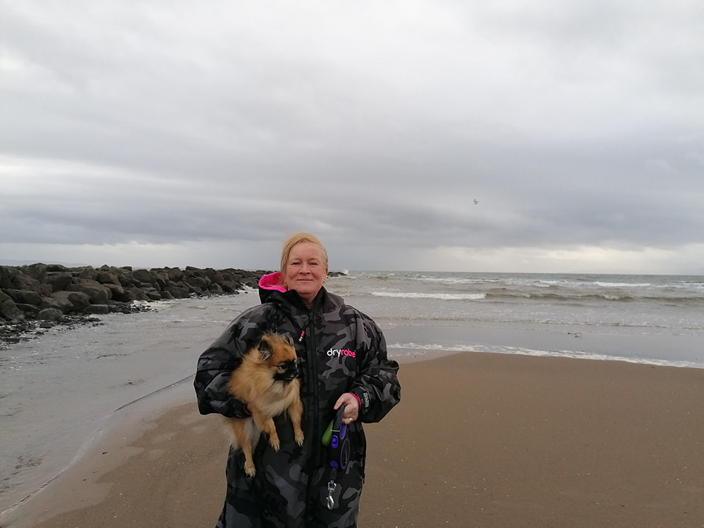
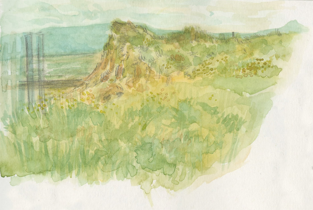
I wanted to create a comic set by the sea because my mum and I often walk our dog at the beach.
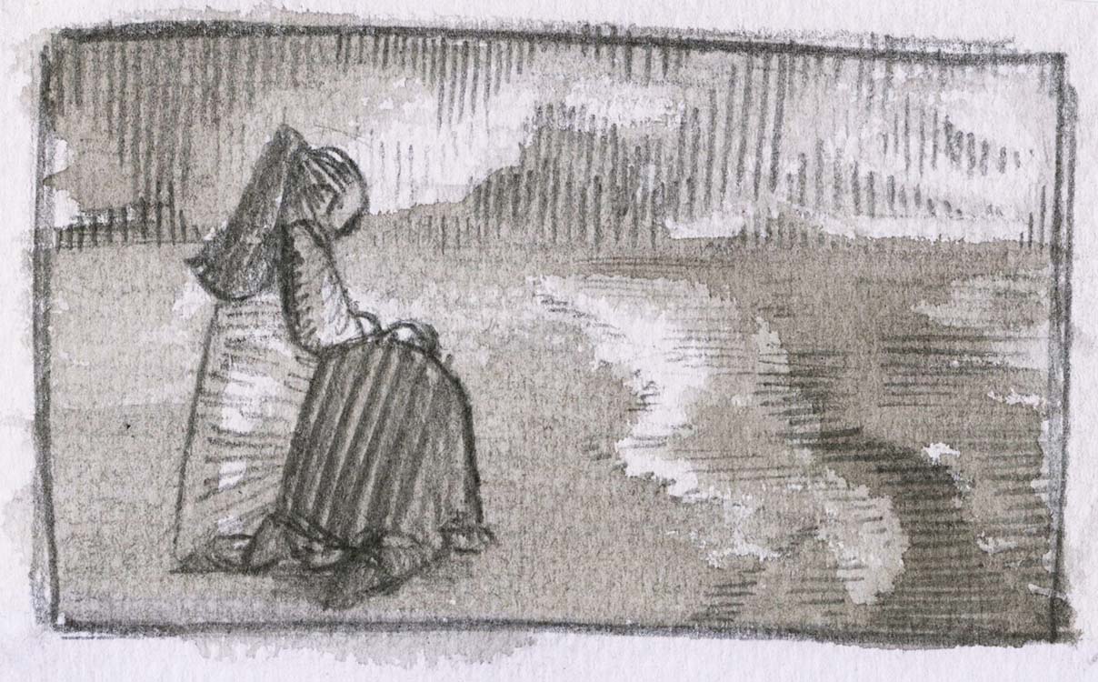
Below is a study of Saltcoats grassy beach.
|

|
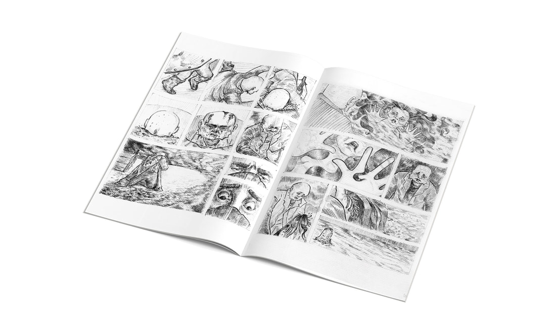
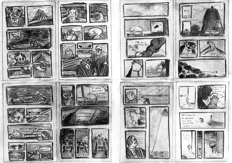
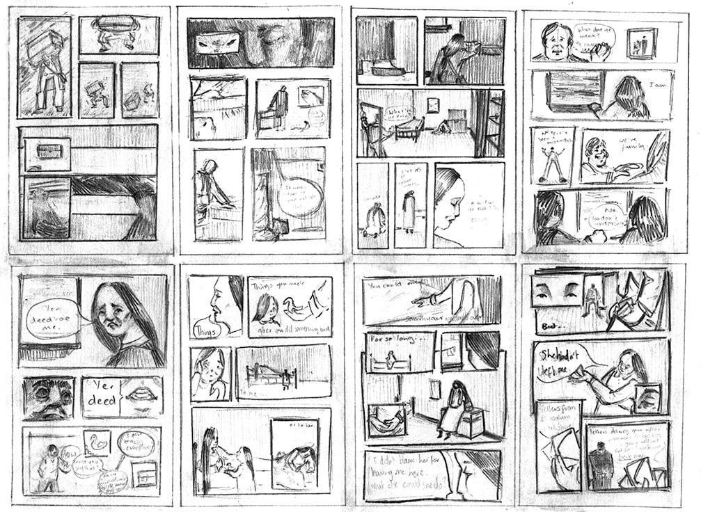
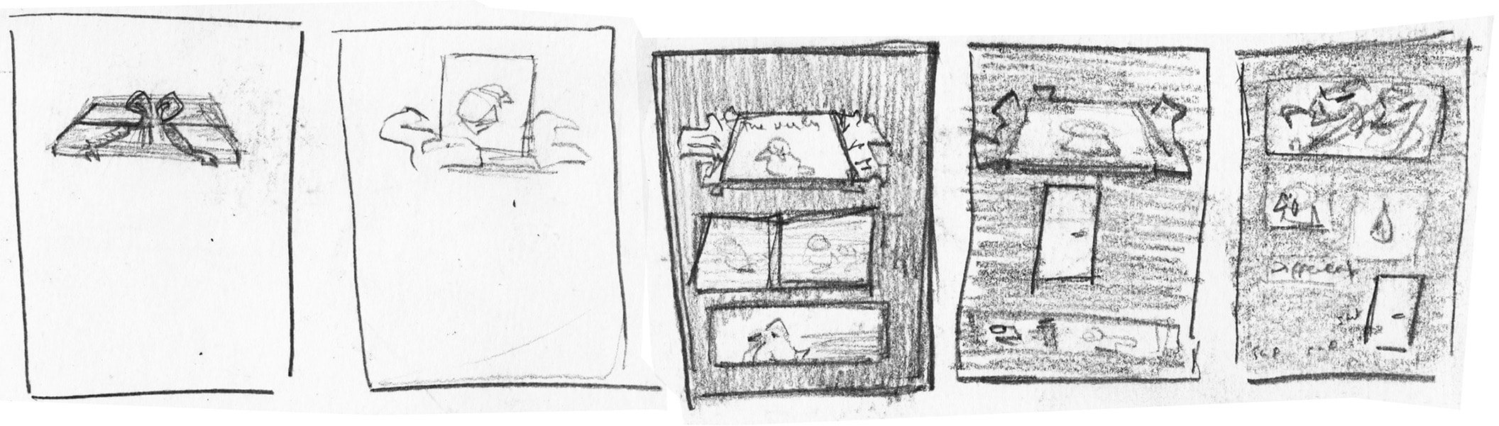
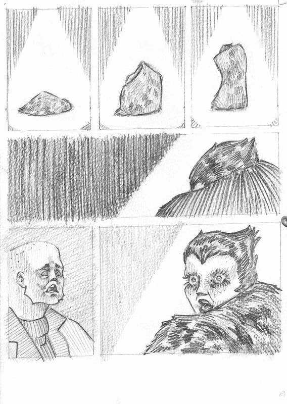
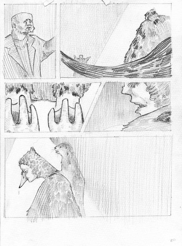
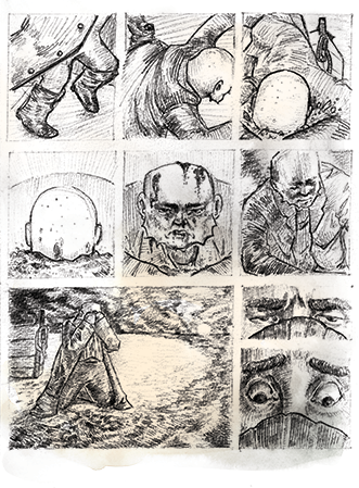
Old thumbnailsThese worked up thumbnails were for an older iteration of the comic in which the father had killed the daughter after she attempts to leave as her mother did. Although the story has changed quite a bit many of the compositions from these thumbnails remained into the new story.
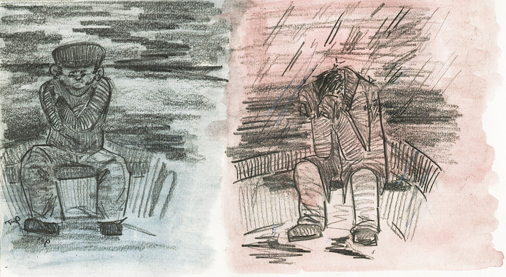
Here we can see my interest in using ink wash on pencil. |
|
|
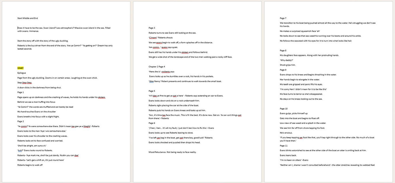
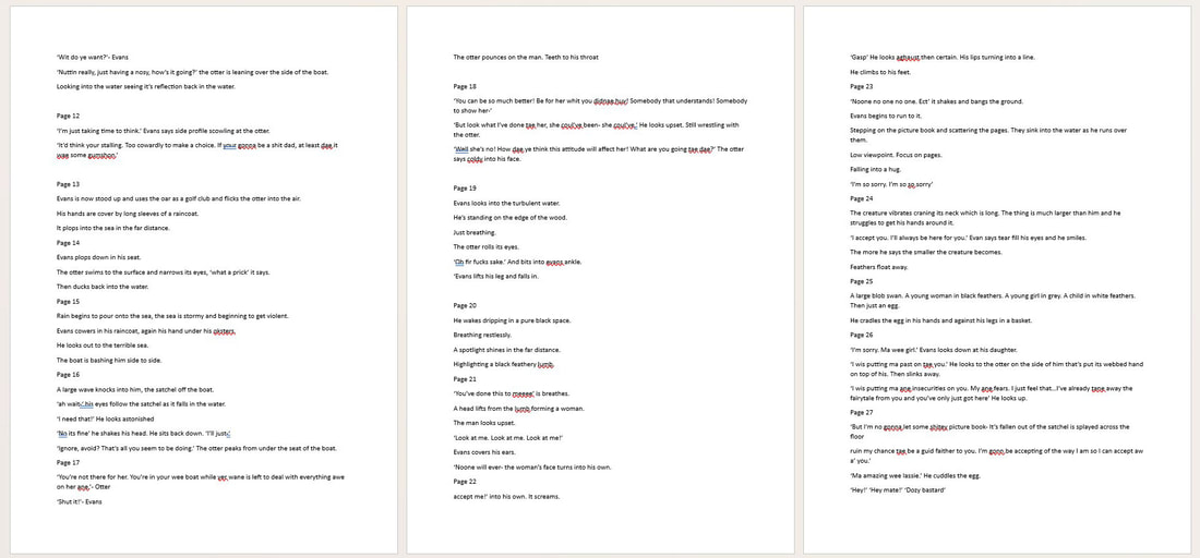
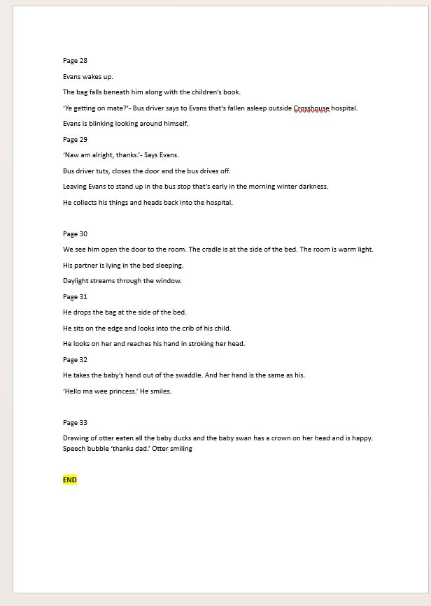
Below is a word document that summaries visuals and story points for each page of the Seafarer comic book.
The character of The Seafarer
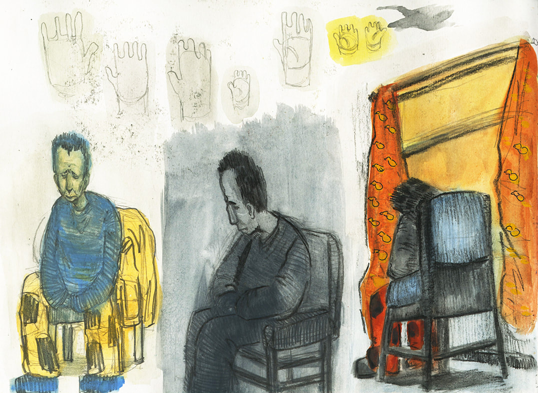
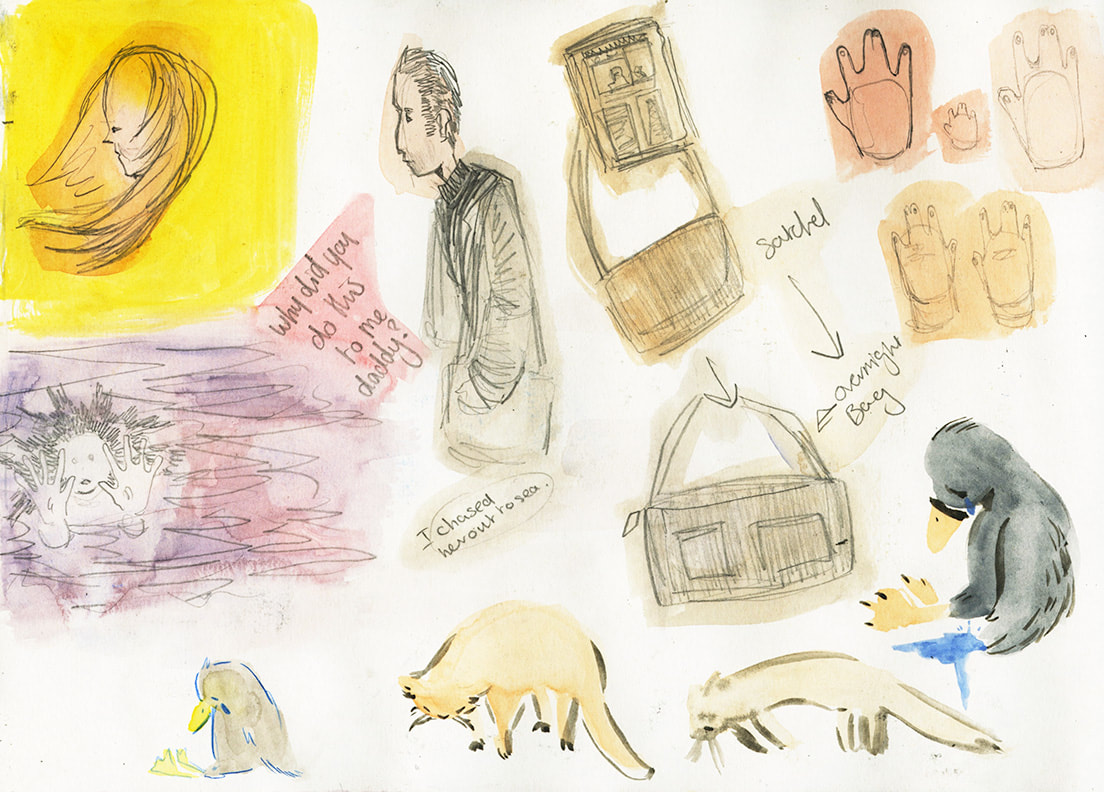
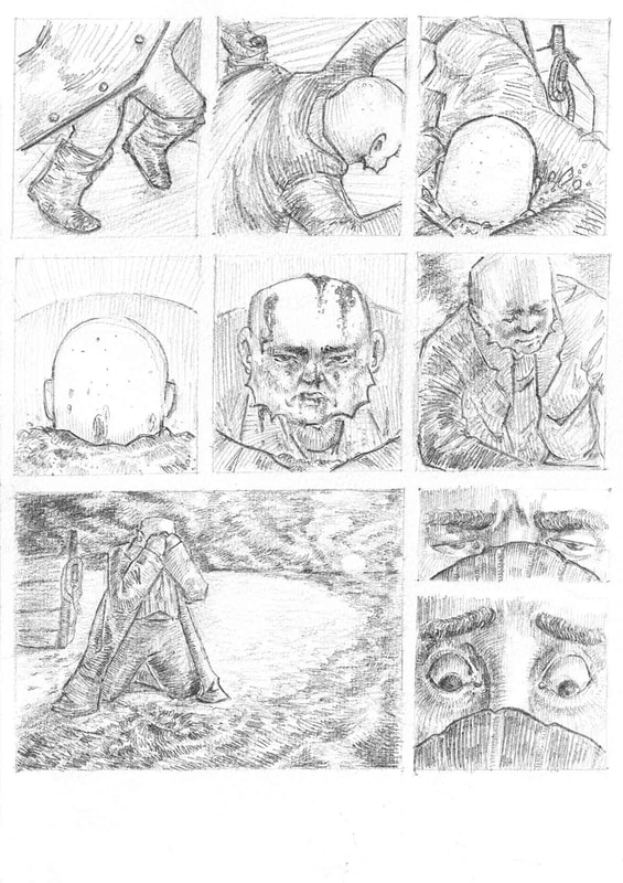
Below are my sketchbook explorations of the main character of the Seafarer. As the story changed so did he, originally he was going to be an older man, then a teen dad but in the final draft he is a young adult in his 20s. The man has a physical disability in his hands, so I would draw hands that have joined fingers and often draw the man in clothes that covered his hands because I wanted the reveal of his hand disability to be towards the end as this would be the major turning point of the narrative.
|
|
|
|
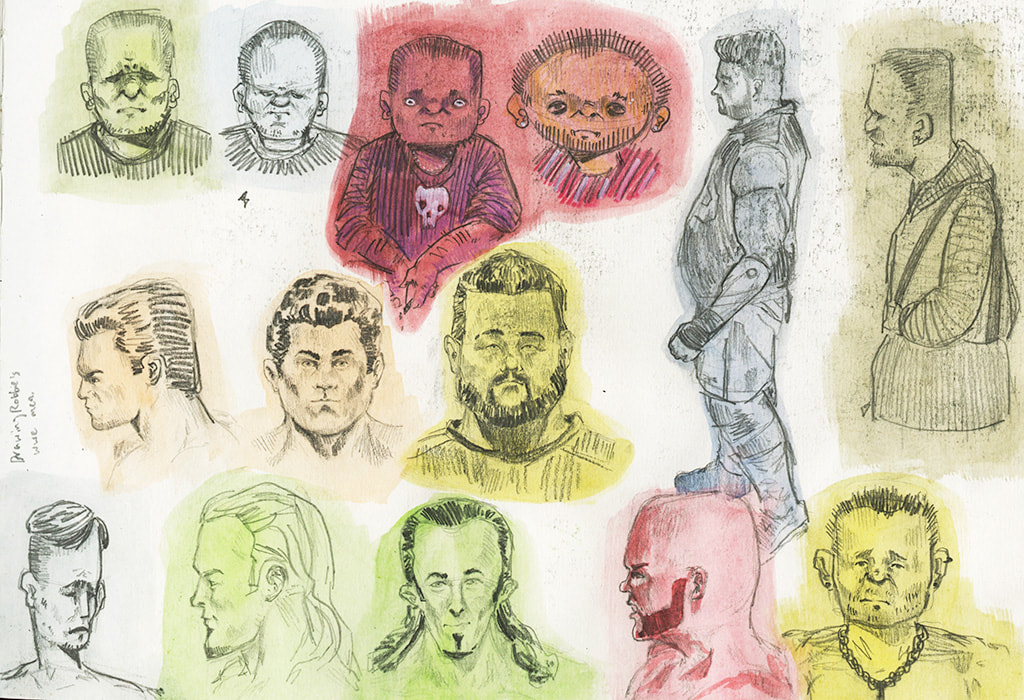
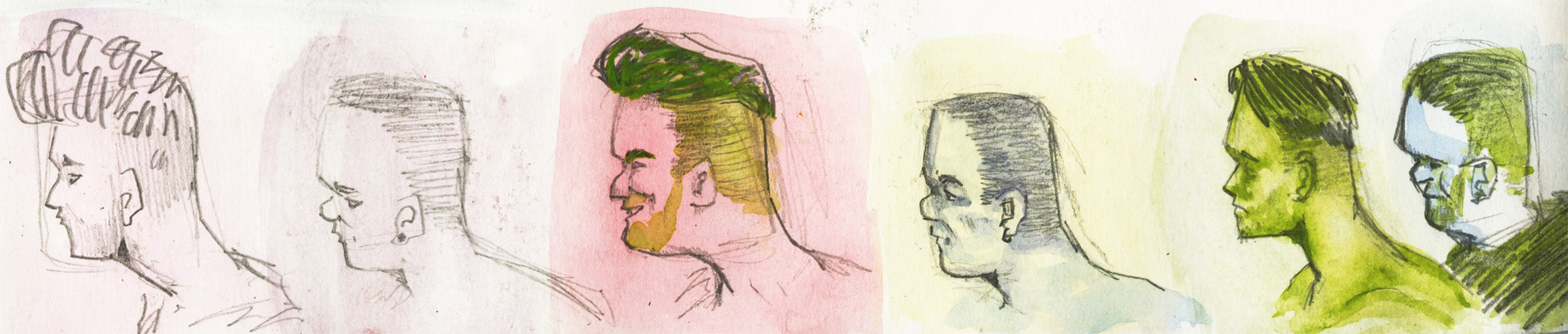
I wasn't sure about how to draw the seafarer, so I studies my brother's WWE figures and would draw male head's in different styles. The colourful washes were used to keep the pencil from rubbing onto the next page.
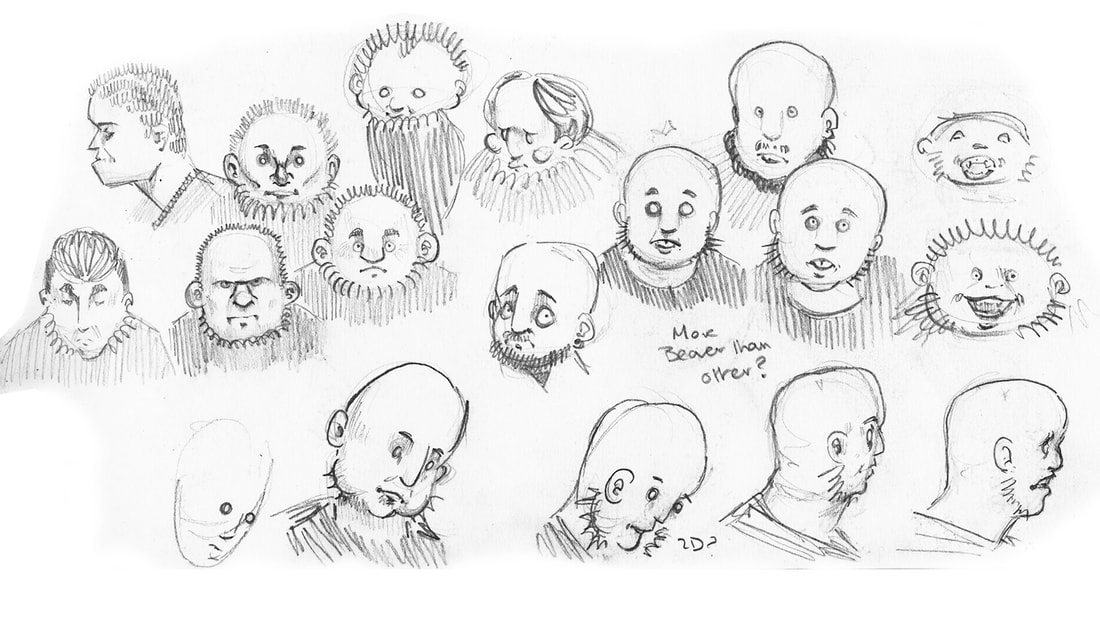
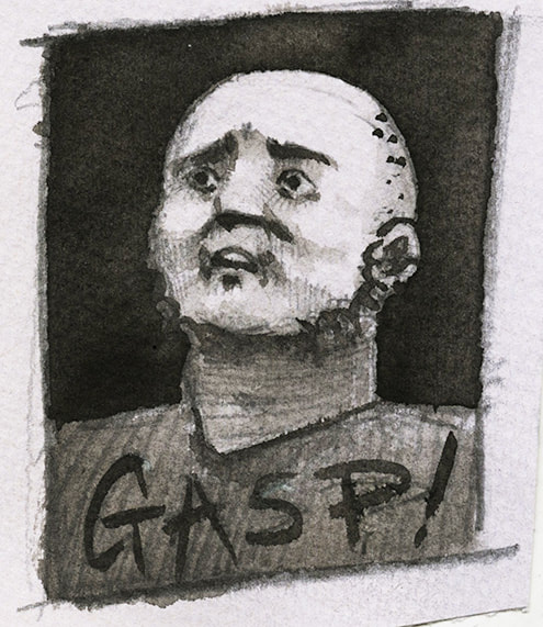
Here I explore heads but with particular characteristics. I knew here that I wanted the man to resemble an otter so to hint that they are one in the same. This was done using facial hair to mimic whiskers.
|
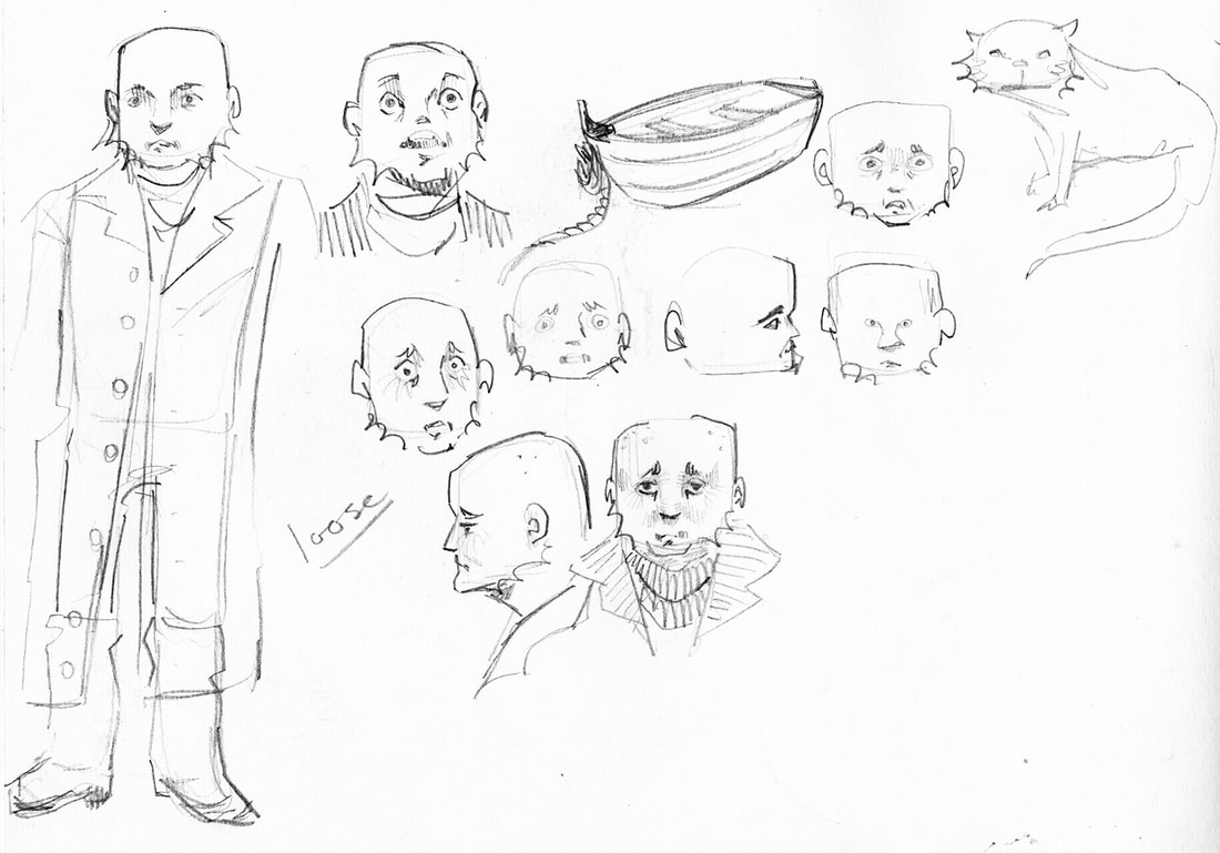
Here the man is the final design for the man.
|
'Nurse' illustrated by Hannah Eaton
I got this comic from the lakes comic festival in first year. So when I was looking to create the seafarer I went through my comic collection and thought that creating the comic using pencil could be very effective.

|
|
|

|

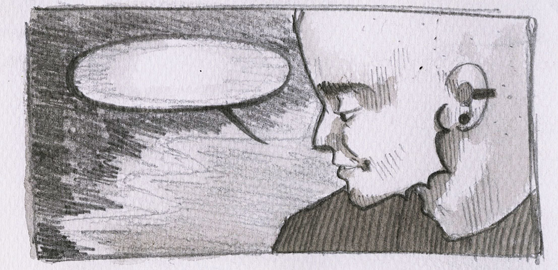
Pencil and black and brown waterclour
|
Media explorationOriginally I intended to create pages in pencil and then use black washes on top of the pencil drawing as seen to the left. However, this process was very time consuming and building up the values with just pencil felt just as effective if not more so.
This also left room for the opportunity to later add textures and colour washes digitally without loosing the pencil drawing. Thus, just pencil was used for creating further pages. The three faces below are my attempts at different media and styles to see what felt right for creating the pages. 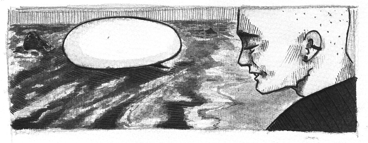
Pencil, ink wash and black pen
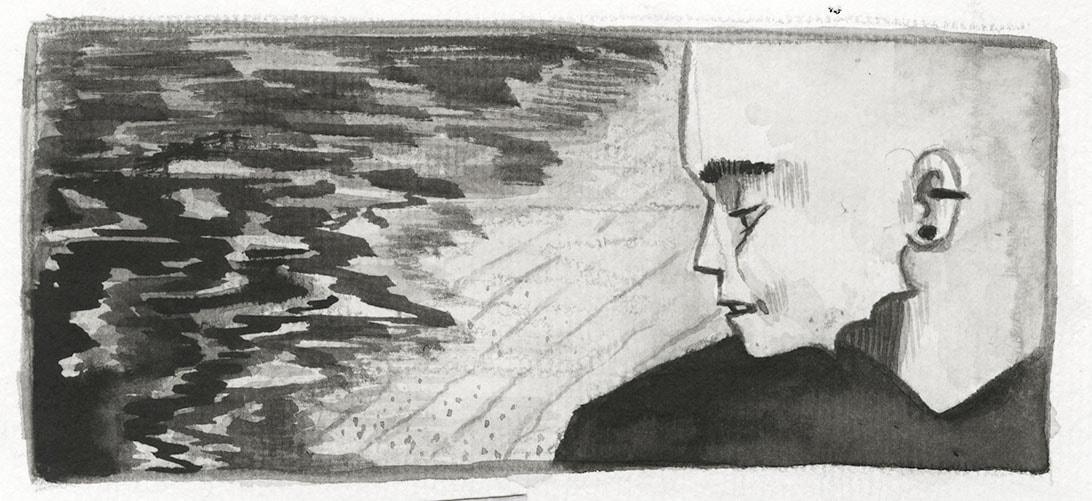
Pencil, ink wash, gouache and black pen
|
|
|
|
Trying to incorportate ink washes and really dark black was inspired by the postcard to the left by an Irvine artist.
However ultimately I feel that just pencil was much more successful and using ink in my work was explored heavily in my other project The Illustrated Child Ballads. 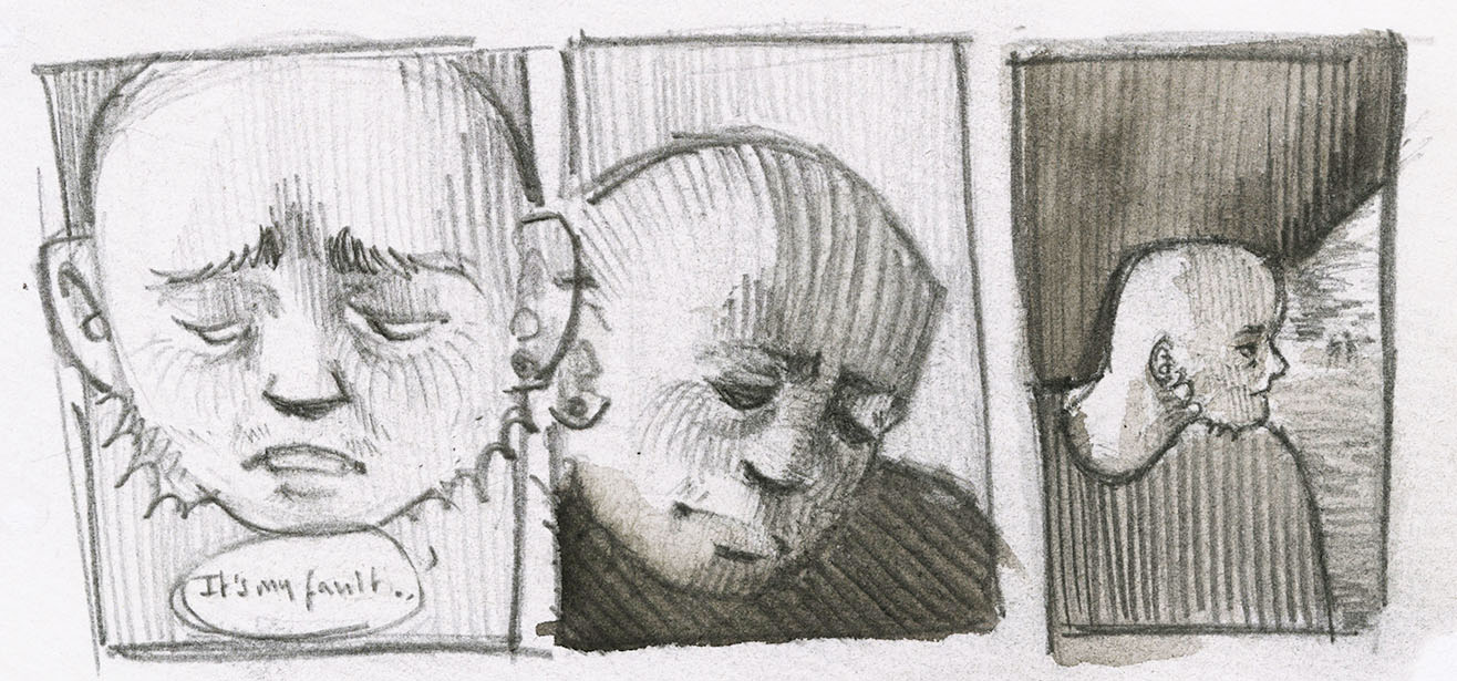
|
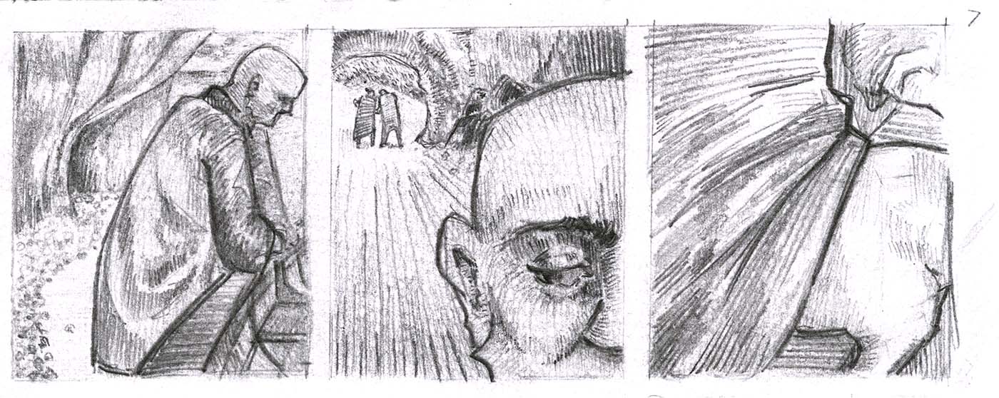
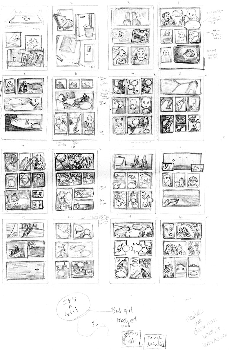
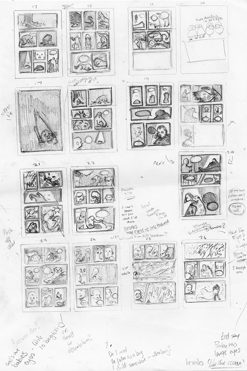
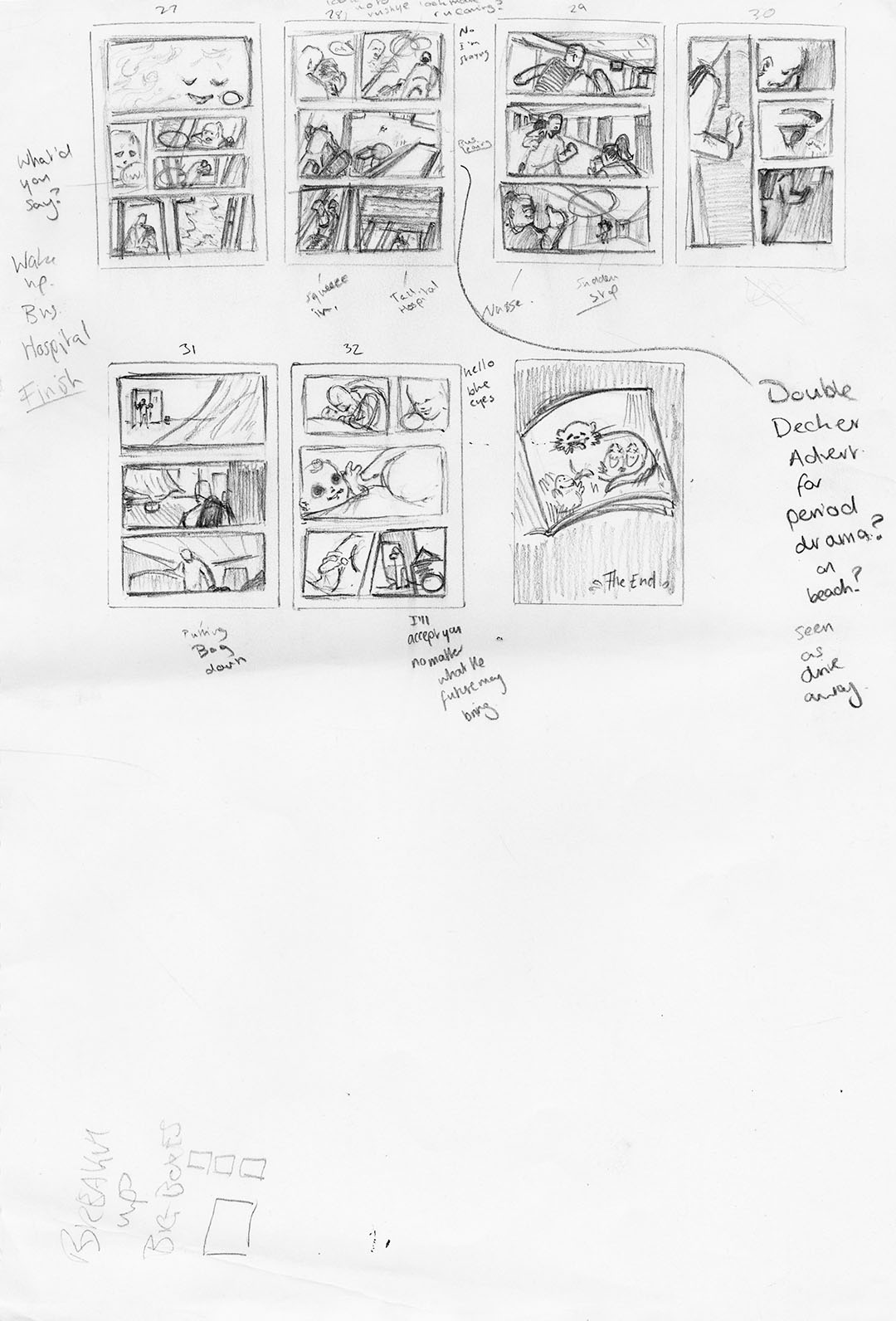
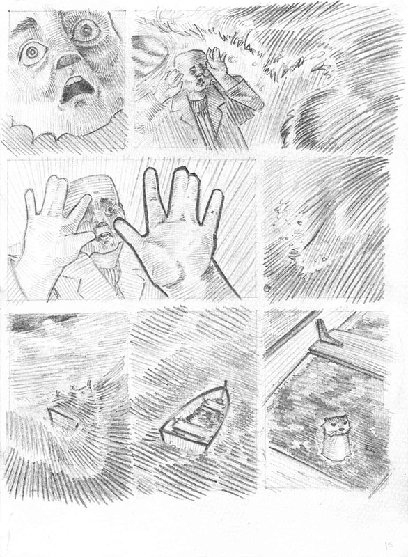
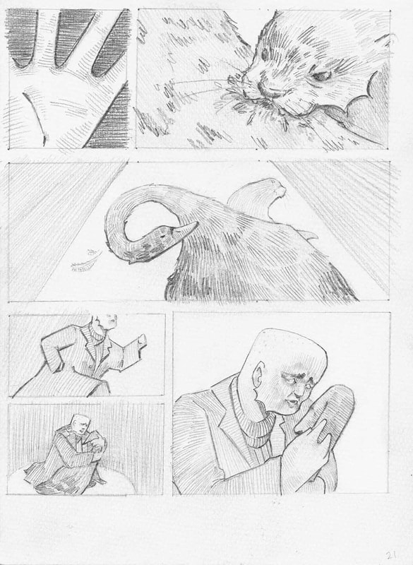
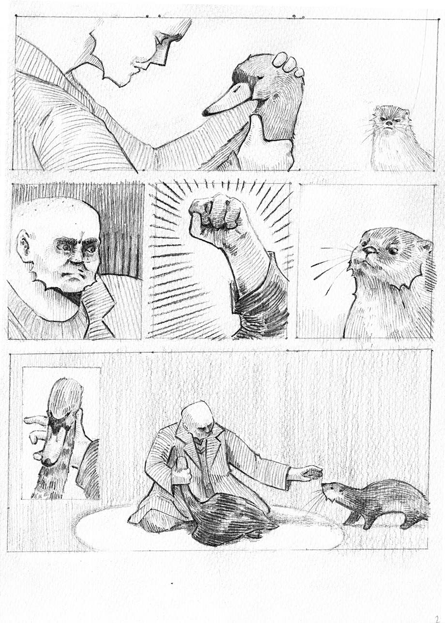
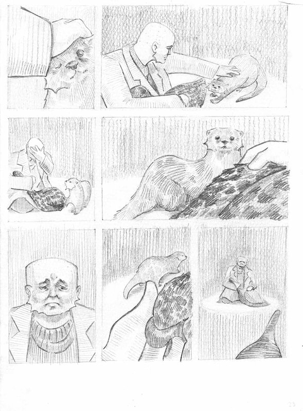
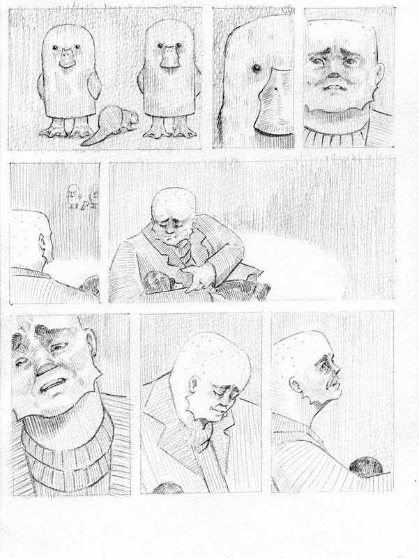
The Thumbnails
|
I these two loose thumbnails I'm experimenting with a couple pages of the comic but below I took three A3 sheets and detailed the whole comic as thumbnails.
|
|
|
|
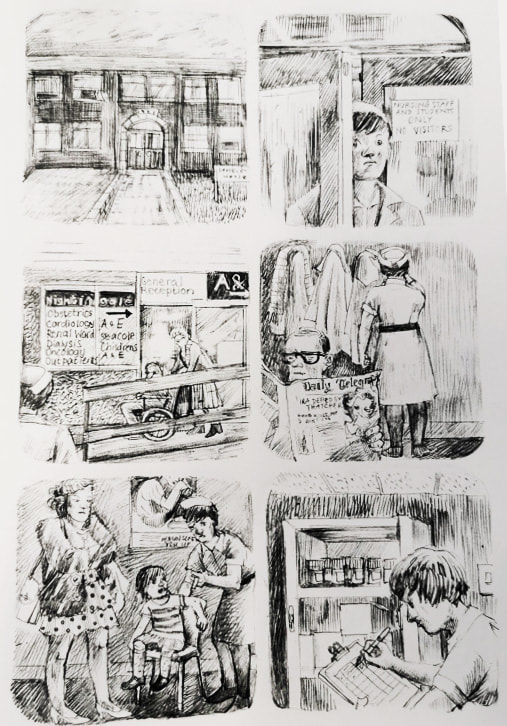
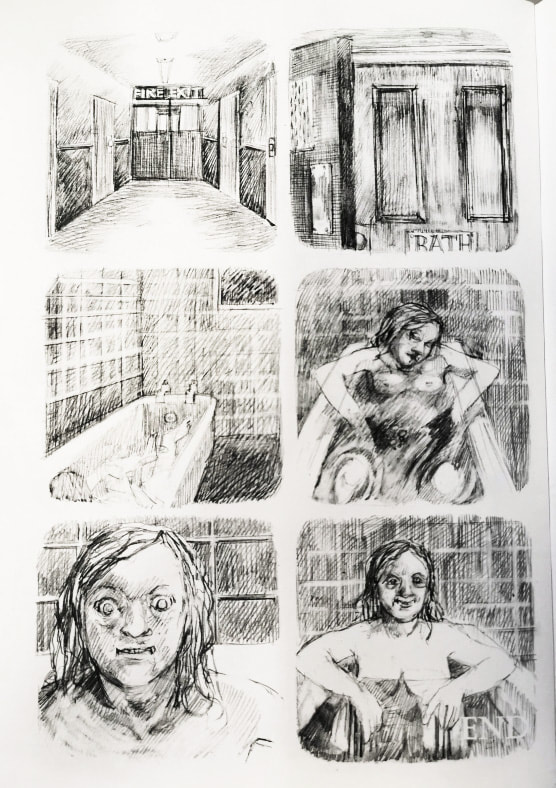
Creating the pages
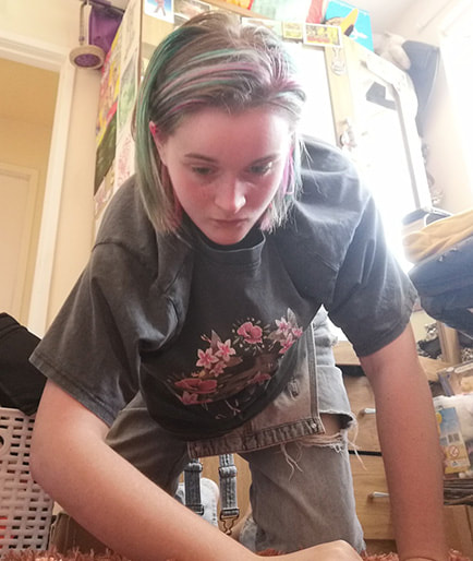
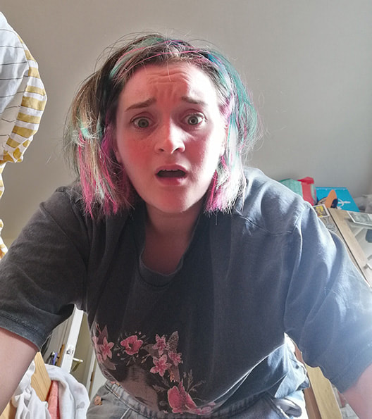
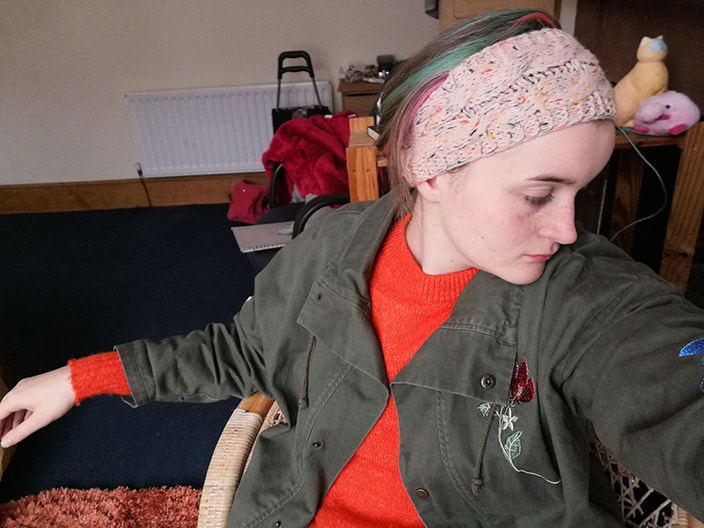
I often used myself as reference for the comic, using the timer on my phone to the photo as I quickly got in position. This was helpful to quickly create references instead of scouring the internet for exactly what I needed.

|
|
|
|
|

|
|

|
|

|
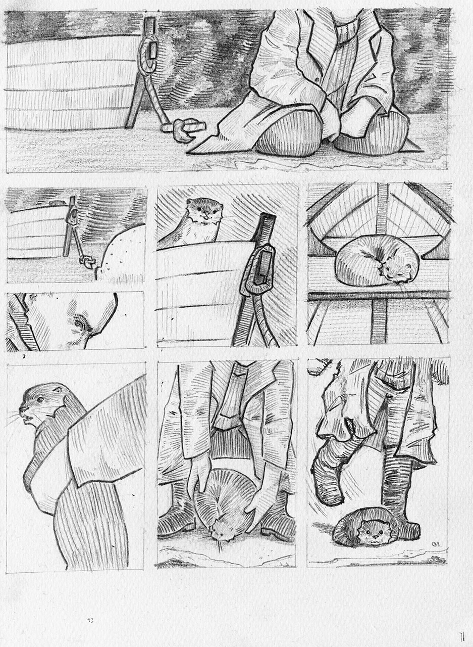
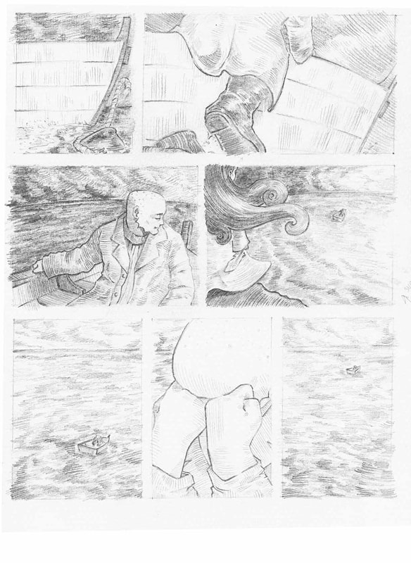
Rather than rub out when a box didn't go as expected I would draw that panel again with the plan to edit it in afterward.
|

|
|
|


|
|
|
|


|
|
|
|
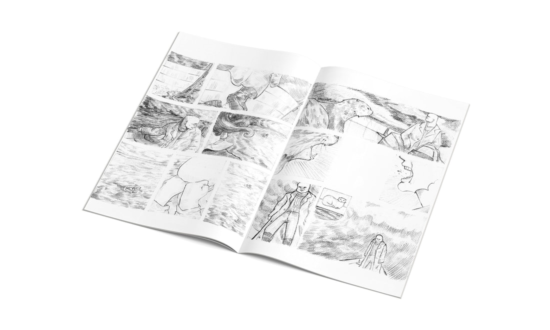
I created about half of the planned out pages for the comic, I feel this is a good amount of work to showcase what the comic could be once finished.
I added light colouring digitally to some pages of the comic as a test, however I think that just black and white is more successful.
I mocked up some of the pages digitally and below are the results. |